18 best email marketing design practices for 2022


Introduction
If you haven’t yet implemented an email marketing strategy, you’re missing out on one of the most profitable channels for your business.
For every dollar you pour into email marketing, you can make an average of $42 back, which is a much higher ROI than most digital marketing platforms.
Your email copy — and how you segment your subscribers — are important elements of your strategy. But email marketing design is just as important to consider.
We’ve already posted about newsletter design inspiration. But what about other types of marketing emails? Which design practices are best?
Read on to discover the most important elements of email marketing design and 18 of the best email marketing design practices to help you wow your subscribers and stand out in their inbox.
Article content
What is email marketing design?
In email marketing, email design is the process that you go through to design your emails in a branded and strategic way.
Effective email designs don’t just look good. They’re also designed in a way that resonates with your target audience.
Email design serves other purposes, too, including:
Grabbing the attention of your readers (and keeping that attention)
Directing your readers to your calls to action
Creating brand awareness
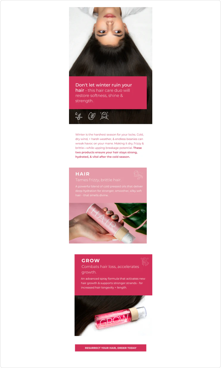
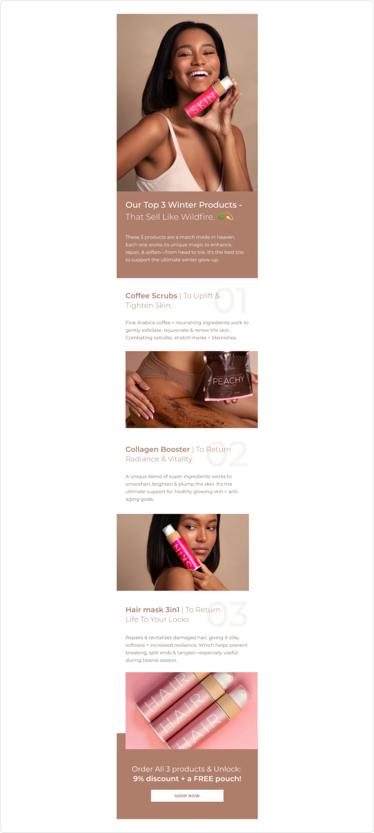
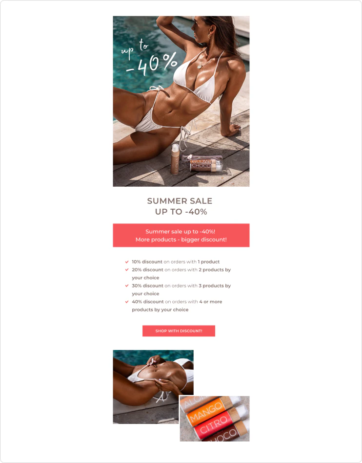
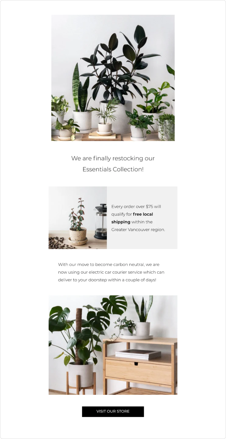
Some marketing emails use lots of design elements. Example:

Others have a more basic design that relies on mostly text.

But even an email that looks like it has no design… actually has a design.
For example, you need to determine the spacing and margins, even in a text-only email. Those details make a huge difference in the readability of your emails, especially on mobile.
The elements of an effective email marketing design
Animation
When people think about email marketing design, they rarely think about animation.
But the truth is that animation can be a powerful tool to make your email designs more attention-grabbing.
Movement attracts the gaze. You can’t use video in email — the technology just doesn’t support it — but you can use animated GIFS to add some life and vibrancy to your emails.
You can use GIFS to simulate animations, like this:

Or you can add GIFS in a text-only email to add humor, illustrate a feeling, or add a specific mood to the email.

You can also use animation to display more information in a smaller space. For example, if you have several images you’d like to show, but want to keep your design minimal, insert a GIF instead!
Layout
Layout is a huge component of your email designs. The layout basically determines how your email will flow, what order your subscribers will consume your content in, and how the gaze will move through the content.
When designing your layout, keep in mind that your above-the-fold content should be designed in a way that incites your readers to scroll down and keep reading. In fact, the entire layout should serve this purpose.
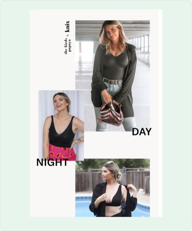
In the example below from Knix, notice how the images overlap with each other. As you look at the first image, you can see the corner of the next one, which is an effective way to attract a reader’s attention so they’ll keep scrolling.

Typography
Don’t choose your fonts lightly. Which fonts and typography elements you choose will not just influence your email design, but your brand image as well.
This goes for the font in a text-only email, but it’s even more important in an email with very little text and several headlines.
Let’s compare two emails that use vastly different fonts. You’ll see how different they both feel.
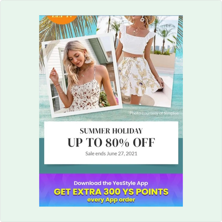
Here’s the first one by YesStyle:
And here’s another one by BeMore Academy:


There’s a lot you can do with typography. Explore the possibilities and don’t be afraid to stand out.
Negative space
When it comes to designing anything — a website, an email, a social media graphic, and even a photograph — negative space is important to keep in mind.
Using negative space can give your design elements some room to breathe. It also stops you from overloading your email to make it look too busy.
Negative space can also create forms in its own right that keep your elements visually interesting. It adds a lot while simultaneously lessening the clutter.

When your subscribers are reading your emails on a smaller screen, like a mobile device, negative space will be especially important.
Color
Finally, the last element you need to keep in mind with email marketing design is color.
The colors you choose will help you set the tone you want your subscribers to perceive.
Your choices can also reinforce your brand identity. Studies show that color can influence the likability and familiarity of a brand.

Colors can also elicit certain emotions. You can use this to your advantage to drive people to take a specific action.
18 best email marketing design practices to wow your subscribers
Now that you’re aware of the five most important elements of email design, let’s dive into some practical tips you can use to design more attractive (and effective) emails.
1. Write a captivating subject line
While a subject line is an element of copy, it’s the first thing your subscribers will see when they come across your email in an inbox.
Because of this, you need to carefully design it not just to be great copy, but to show up just like you want it in the inbox.
The copy itself should pique your subscribers’ interest. It should make them want to click and open the email to find out more.
But your subject line should also show up fully in an inbox. If it’s too long, your subscribers won’t be able to read it all when they’re on their mobile devices.
Just take a look at these subject lines:
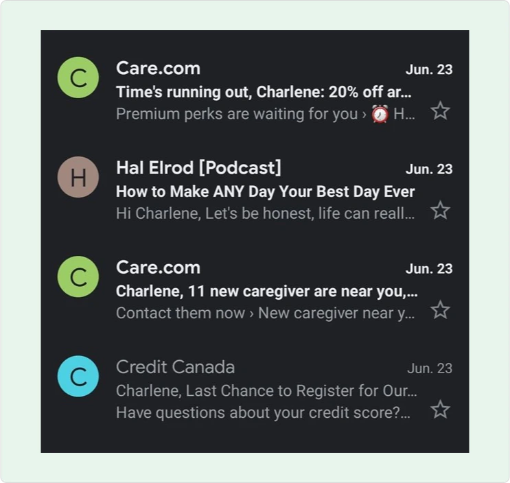
Out of four emails, only one has a subject line short enough to show up fully on mobile devices.
That means you need to write and design your subject lines to be short and concise.
2. Craft an enticing pre-header
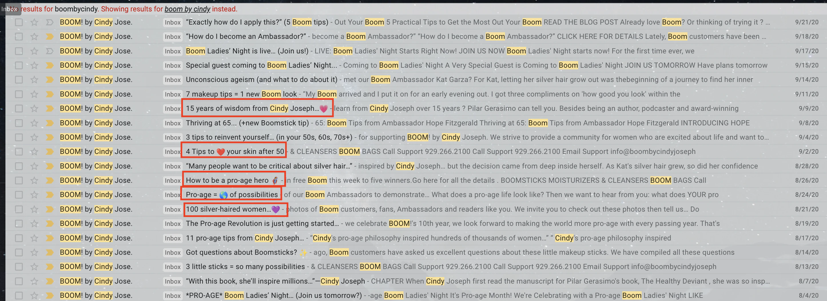
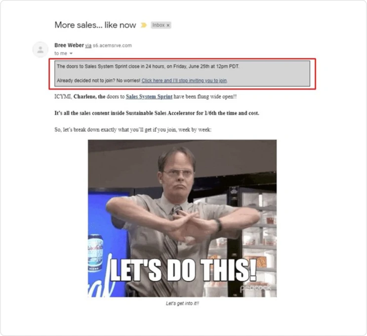
Pre-headers are the lines of text that appear just after the subject line in your inbox. They’re the ones that appear greyed out in Gmail.

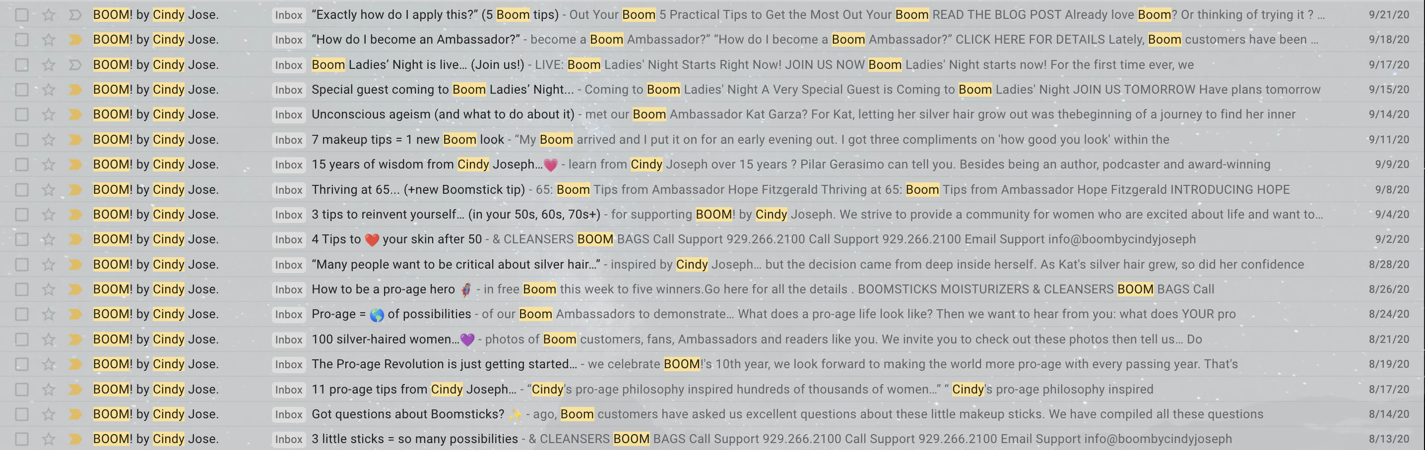
Just like a subject line, your pre-headers shouldn’t be too long. Even on desktop, pre-headers that run too long won’t fully show up, as you can see above in the pre-headers that arent’ highlighted.
By default, emails will show the first sentence of an email. Unless the first sentence happens to be short, this will make the pre-header too long.
It also doesn’t make the best use of this valuable real estate in your subscribers’ inboxes. Instead of leaving it up to chance, make sure to craft an attention-grabbing line that provides more context or insight about your email.
Pre-headers are a second chance to grab your subscribers’ attention. Don’t waste it by leaving it blank.
3. Sprinkle in some emojis
Like mentioned above, subject lines are mostly copy, but they are also design elements.
You can add visual elements to your subject lines in the form of emojis.
Of course, you can add emojis in your emails, too, but they can be especially effective in your subject lines. Emojis can communicate complex feelings in very little space, which can help you make use of the space you have to craft a compelling subject line.
Emojis can also help you stand out in an overcrowded inbox.

Within an email, emojis can add personality and communicate specific tones.

4. Add unique content
It should go without saying that your email content should be unique.
In order to be remembered, you need to develop your own brand. Because of this, you should create content that is unique in its own way.
Whether you provide insights that are unique to your company’s point of view, create promotions that are unusual, or play with elements that aren’t too overused and mainstream, find ways to be unique so you can be remembered more easily.
5. Match your design and your copy
Your design elements will visually entice your subscribers, but your copy is what will get them to take action.
This means that your copy and design should work seamlessly together.
Before you design an email, make sure to figure out how many words or characters you want to use for copy. That way, you can make sure that your email is custom-designed to fit your copy, and not the other way around.
If you design yourself into a corner, you won’t be able to write the copy you need to optimize your conversion rate.
6. Develop your own brand identity
You can take inspiration from other email marketers to inform your own design decisions.
But at the end of the day, you’ll see more results if you develop your own brand identity.
When you do this, subscribers will be more likely to recognize your emails when they see them. They’ll remember who you are instead of forgetting which brand you are out of the hundred (if not thousands) of other brands that send them content in their inbox.
Think about some of the last emails you’ve read. Which ones stood out more to you? Were they the ones that used similar design elements to all the other emails in your inbox? Or were they the ones that developed their own branding style and are now recognizable as a result?
7. Keep your designs clean, simple, and minimalistic
There’s no need to throw every single design element at an email and hope something sticks.
Simple and elegant can be just as effective as an email with several elements. In fact, it can be even more effective, since the important elements stand out instead of getting drowned in a sea of clutter.

8. Add a designed email signature
Instead of sending an email as a business or brand, consider sending it as an individual.
The person sending the email doesn’t have to be the business owner. It can be the community manager, customer service manager, or other positions in your business.
But when you add a real name to an email, it adds a human touch. Subscribers remember that they’re not just reading an email from a business — they’re reading an email that was written by a real person.
This can make the business more personable and memorable.
But, in addition to adding a name, you can also add a designed email signature. In this signature, you can add contact information, but you can also add important links or calls to action.
Keep in mind that the signature doesn’t just have to be a signature in the traditional sense. Let’s take a look at Run Like Clockwork’s email signature:

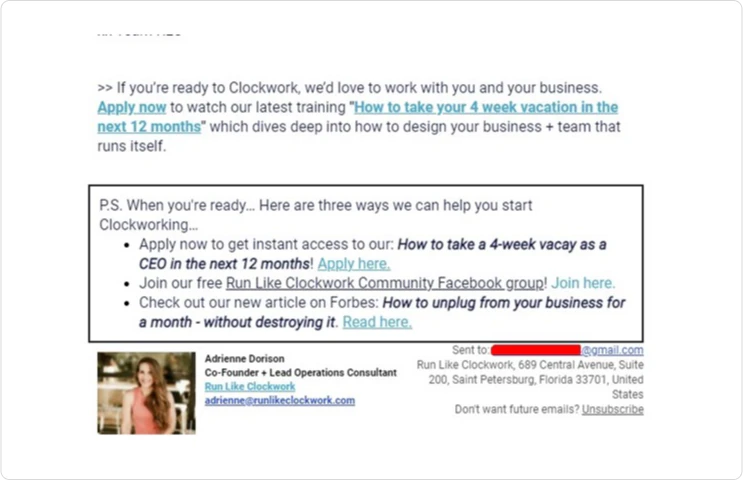
There are two major components to the signature. The first is at the bottom, where you see Adrienne’s name, photo, and contact info.
But the square above that is also part of the signature. It appears in every email this brand sends.
This part of the signature is a call to action. It’s a soft sell, but it’s always there. When readers are ready, they know they can scroll down to the signature to get the links they need to take action.
9. Increase conversion rates with call-to-actions
Speaking of calls to action — they’re a must in any email.
Even if you’re sending an email just to nurture your subscribers, you should still call them to action in one way or another.
The design of your call-to-action button matters. If it gets lost in the rest of the design, that can hurt your click-through rate, and as a result, your conversion rates will fall.
Notice how Fitbit makes their call to action stand out in their email design:


While the rest of the email uses shades of blue and green, the call to action is bright pink. It easily stands out from any other design element.
10. Include an ‘unsubscribe’ button
In several countries and regions across the world, you’re required by law to have an ‘unsubscribe’ button for your subscribers.
At first thought, it would make sense to hide this or make it as small as possible in your email design. But this isn’t the case.
Here’s the thing — if someone feels like unsubscribing, you should make it as easy as possible for them to do so. Keeping them in your email list won’t help you make more sales and increase your conversion rates. It will do exactly the opposite.
This person will most likely stop opening your emails, which will reduce your open rate. A worse open rate can affect your deliverability.
But that subscriber can also report your emails as spam. This will also affect your deliverability and make you end up in more spam boxes over time.
Another thing you can do is give your subscribers the option to opt out of specific promotions. When you do this, you can reduce your chances of getting marked as spam, and you can retain subscribers that love your other stuff but just aren’t into your latest promotion.

11. Experiment with 3D images
Emails can’t render 3D. However, you can create 3D scenes and models and insert images of these scenes in your emails.
This isn’t something very common in email design. Magic Spoon is a brand that uses this concept in several of its emails.

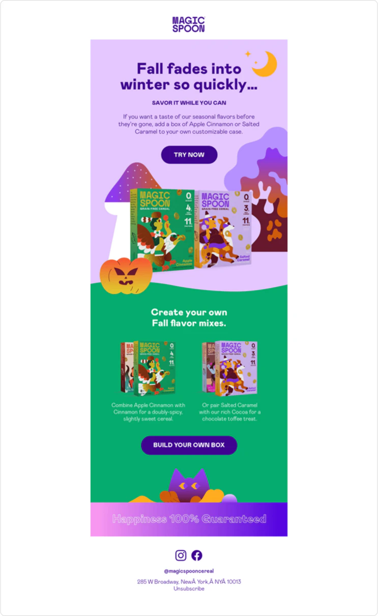
More often than not, they showcase their cereal boxes as 3D items instead of showing the flat box cover.
While this undoubtedly adds an element of complexity to your email design process, it can pay off if it helps you create a unique brand identity.
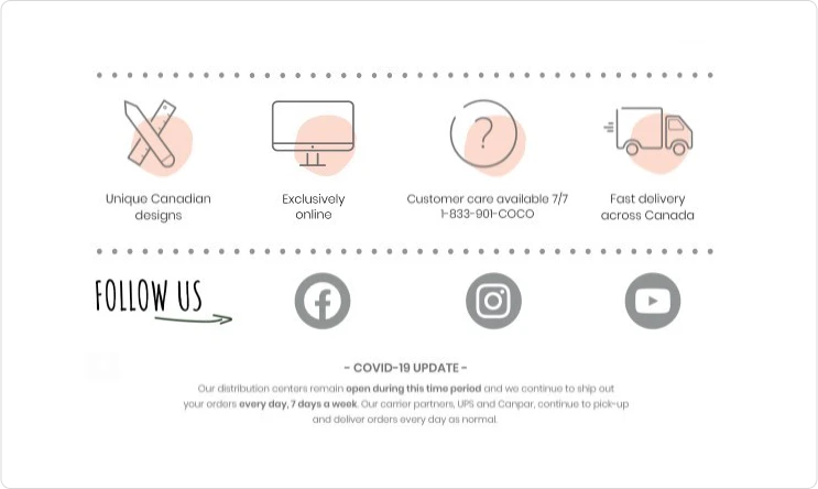
12. Use icons
Icons add personality to your email designs. They also make your content more unique if your icons are custom.
A well-designed icon can attract the attention of a reader to highlight important points and benefits.

13. Create custom graphics
There are countless resources online to find stock images and graphics for your emails. For example, you can add design elements and icons when you use Canva.
However, these graphics are designed for other brands. They have nothing unique that will help you establish your own brand.
Instead of relying on graphics that other people designed, consider creating custom graphics that are specifically tailored for your brand — and your email designs.
Magic Spoon does this with their emails. In addition to using 3D designs, they also make custom graphics for nearly each email.

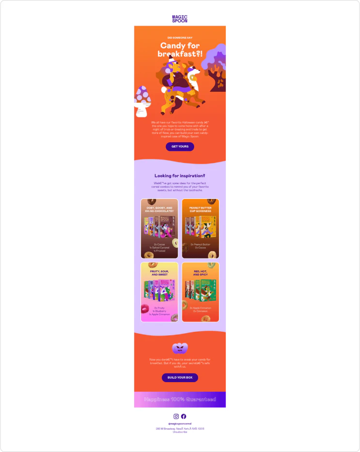
No other brand can use these graphics in their emails. This makes Magic Spoon unique and memorable.
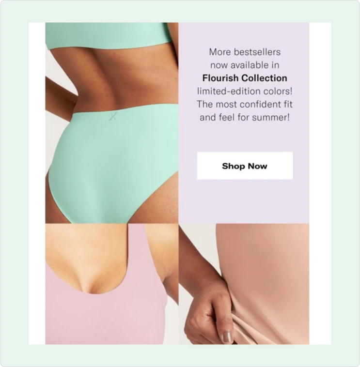
14. Grab attention with color
The colors you choose for your emails matter. Not only should they be on-brand, but they should also grab your subscribers’ attention.
This doesn’t mean you have to create in-your-face emails that have bright colors. This works for brands like Magic Spoon, but it’s not the only way to attract attention.
Subtle use of color in a minimalist email design can be just as effective to capture the gaze. You can also play with color to keep subscribers scrolling.
Take a look at the following email from Knix. The text box uses the same color as the image below, which ties the design together perfectly:

15. Design responsive and mobile-friendly emails
Your emails should look good, no matter where your subscribers will read them.
So when you design your emails, keep all potential platforms in mind, not just the one you’re designing on.
A design that looks breathtaking on a desktop can look clunky and weird on a smartphone.
Your call-to-action buttons should be responsive if possible. That’s because they’ll be too small on smartphones if you design them for desktops only, and too big on desktops if you design them for smartphones only.
16. Add personalization in every email
Make your subscribers feel like you are talking to them directly by adding personalization.
This includes using their first name, but you can personalize other elements of your emails. It all depends on what information you have on them.
For example, you can add product images based on products they’ve interacted with in the past. You can also send them personalized promotions based on their favorite products.
17. A/B test design concepts
How do you know what design elements will work the best for your audience?
You don’t.
The only way to know what will work best is to test it out.
To do this, you can perform A/B tests to validate new design concepts. This involves sending one email with one concept to a portion of your subscribers, and another email with a second concept to the rest of your subscribers.
Then, you can analyze which design performed better.
There are two ways to do this. You can either send emails to every subscriber and use that data to inform your next campaigns. Or, you can send the A/B test to a small fraction of your subscribers, then send the winning variation to everyone else.
18. Stay concise
You should add as much content in your email as needed.
No more, no less.
If you don’t need more than three words to give value and drive your subscribers to take action, then stay concise and keep it at three words.
It’s okay to make an email longer if you need it to be. But avoid creating overly long email designs just for the sake of making them bigger and longer.
For example, if you’re selling something that requires a lot of explanation, the first email in a promotion can be long. But not every email in that promotion should be the same length.
Some should be shorter when they can be.
Sometimes, it pays off to just get to the point and leave it at that.

Desired outcome
Well-designed emails should help you improve your sales and grow your business at scale. But they should also help you build a sustainable brand that you can rely on for years to come.
Your email list is one of the most valuable sales tools you’ll ever have. Remember this fact each time you send an email and ask yourself:
Will my subscribers get value from this?
Will the design of this email help me increase sales short-term, but also increase the loyalty of my subscribers long-term?
Is this email in line with my brand values?
Aim to be more than just a fancy design in your subscribers’ inboxes.
Increase your sales with powerful email marketing design
These email marketing tips will help you elevate your email designs in a way that increases your sales, but also helps you scale your business in the long run.
Need help with your email marketing strategy? Our email marketing agency can help you get results from email. Schedule a call with our team to get a free marketing plan tailored to your unique business needs.